Red Deer designers took the earthy, warm vibe of the restaurant at London's National Gallery and created a space that's a work of art in its own right.
W hen embarking upon a design project as monumental as Ochre, the restaurant at the National Gallery, Lucas Che Tizard, founding director of architecture studio Red Deer, says the key is to start with a story.
"We don't want to be egotistical with imposing a design, so we start with the story of the client," Tizard says. "It's about going back to the roots: why did the client set up? How did they get to this point, where they want to open a restaurant? We then build on that story, combining it with the location – where it is geographically and culturally – with other influences."
Tizard also took inspiration from the people behind the project – Ochre founders Sam and Charlotte Miller, who are responsible for the Muriel's Kitchen brand – and the menu that makes the restaurant tick. Tizard says that, above everything, he wanted his design to be unique.
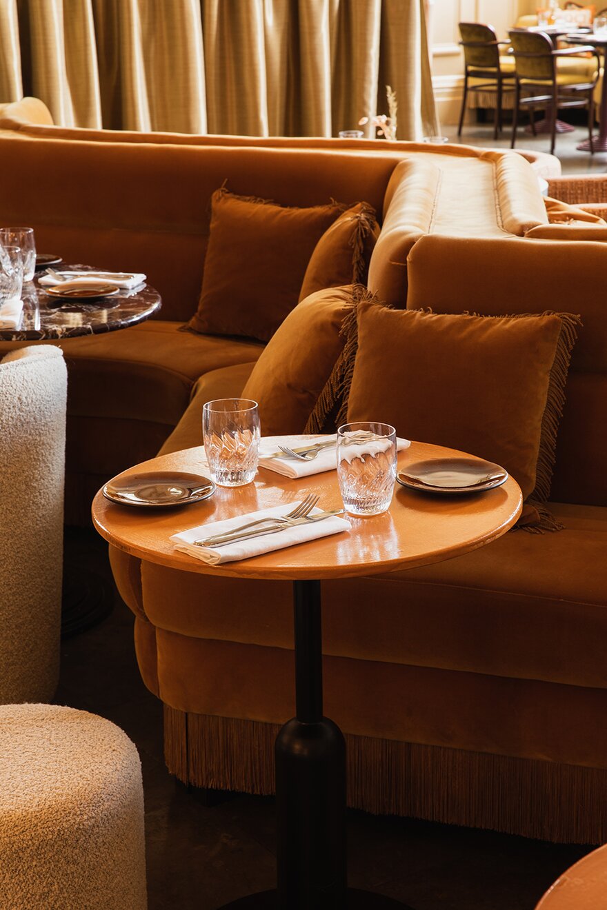
"They came to us and said they liked the name Ochre as it reflects them as a company, being from the ground up and with reference to roots, earthiness and soil," Tizard says. "We ran with that, applying it to the concepts, so that's why you have the richness of earthy colours within the restaurant. They also wanted it to be a high-end offering, so we combined that with plush finishes."
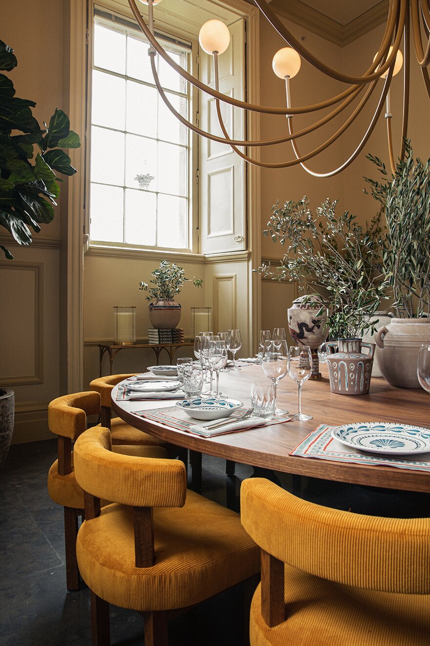
The history of the building itself prompted Tizard, who has experience working in listed spaces as well as residential and industrial settings, to think outside the box. "The walls have a lot of historic panelling, which had to be retained," Tizard says. "We also had a strategy from the get-go for lighting, which was to not attach wall lights, so that's why we created these large, sweeping floor lights."
Sustainability was also high on the list of priorities for the designer, who worked with local craftspeople and used repurposed banquettes in the dining room. "We see projects as a collaborative endeavour and not a dictation," Tizard says. "I had a banquette specialist come to the site and we dismantled a section of banquette to see how it had been constructed. We then looked at my design proposals for the seating to see whether or not we could achieve what we wanted."
It is equally important for Tizard that the roots-up aesthetics of the space reference the history and purpose of the building, hence his pivoting of the design around a painterly element. "This is why we created this central banquette, which sweeps across the space, and we also made the seating double-sided," Tizard says.
"One side is a plush banquette booth restaurant area and the other side, which faces the bar, is a cocktail-drinking area. This idea of a brush stroke is also seen in the sweeping lights."
The feeling of luxury doesn't stop here, as Tizard set about blending the earthy connotations of Ochre with the grandeur the 65-cover space demands. "The tactility was an easy way to reference that," Tizard says. "Plush fabrics make it suggestive of a long stay rather than a ‘get in and get out' place. We used marble for the bar counter-top and we worked with ceramicist Emma Lloyd Pane to design some ceramic tabletops that again have sweeping brush effects," Tizard says.
Tizard's background in architecture also helped in how he visualised the space and the effect of the design on diners. "The seating is quite low level and the intention is to not interrupt the visuals of the existing panelling," Tizard says. "It's a very ethereal space and your eye is not interrupted across the room."
Carefully selected soft furnishings are also at the heart of this restaurant, with the heavy velvets being Tizard's personal favourite. "It's just such a luxurious and timeless fabric. I really enjoyed using the tassels as well and combining them," he says. "The boucles [a knotted wool used in the drinking space] were really fun as well."
The success of the space in how it has been received by both the Millers and by diners since its opening in April last year speaks for itself. "The restaurant has been immensely popular and really busy," Tizard says. "That's always the ultimate result – that the space is being used how we wanted it to be. The ultimate test is when they open the doors and see how customers use the space. And it's hard to get a table, so that's always a good thing."
When asked what his advice would be for designers of similar spaces, Tizard's answer is simple – "being individual is key. We very rarely reference other interior designers or architects. We look at colours – or paintings in this case – and try to be unique," he says, adding that the all-important story must remain at the heart of everything.
Continue reading
You need to be a premium member to view this. Subscribe from just 99p per week.
Already subscribed? Log In


